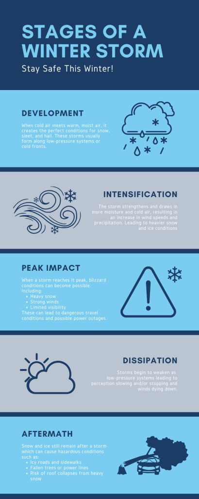
I’m sure I’m not the only one who can say that science can sometimes he hard to grasp, especially when it’s not your strongest subject. But, what if I told you were could break it down in way that makes it easier for the average person to understand? Well, you’re in luck. Infographics allow us to breakdown complex information such as scientific concepts and present it in a way that makes it easier to digest.

Infographics are an easy way to take complicated topics and make them simple, engaging, and easy to understand. They combine visuals, text, and data in a way that’s not only eye-catching but also effective when it comes to helping people process and remember information.
When you’re faced with a dense block of text or a long spreadsheet, it’s easy to get overwhelmed. But add a few charts, icons, or illustrations, and suddenly, the key points jump out at you. Simple visuals can turn abstract ideas into something tangible and relatable.
Infographics also work wonders for different learning styles. Some people are visual learners who thrive on images and graphics, while others prefer text or numbers. Infographics bring these elements together in a way that’s accessible for everyone.
Infographics are also easily sharable, whether you’re posting on social media, writing a blog, or giving a presentation, infographics are a fantastic way to grab attention and get your message across.
At the end of the day, infographics make information not just easier to understand but also way more enjoyable to explore – and who doesn’t want that?
Citations
Cao, J. (2018, June 11). Web design color theory: How to create the right emotions with color in web design. TNW | Tnw. https://thenextweb.com/news/how-to-create-the-right-emotions-with-color-in-web-design
Dennison, B. (2017, March 28). Practical visual literacy for science communication: Blog. Integration and Application Network. https://ian.umces.edu/blog/practical-visual-literacy-for-science-communication/
Education, U. C. for S. (n.d.). Center for Science Education. Winter Storms | Center for Science Education. https://scied.ucar.edu/learning-zone/storms/winter-storms
Kolowich Cox, L. (2024, September 11). How to create an infographic in under an hour – the 2024 guide [+ free templates]. HubSpot Blog. https://blog.hubspot.com/marketing/create-infographics-with-free-powerpoint-templates
Marquez, A. (2022, April 2). Introduction to multi-sensory design. Akna Marquez. https://www.aknamarquez.com/blog/2017/7/23/what-is-multi-sensory-design
Patel, N. (n.d.). The Complete Guide to designing stunning visual content (even if you’re not a graphic artist). NeilPatel. https://neilpatel.com/blog/the-complete-guide-to-designing-visually-stunning-content-even-if-youre-not-a-graphic-artist/
Simplicity, symmetry and more: Gestalt theory and the design principles it gave birth to. Canva. (n.d.). https://www.canva.com/learn/gestalt-theory/
US Department of Commerce, N. (2024, March 11). Winter storms and blizzards. National Weather Service. https://www.weather.gov/fgz/WinterStorms
US Department of Commerce, N. (n.d.). Safety. Todayâ€TMs Forecast. https://www.weather.gov/safety/
Wicker, C. (n.d.). Winter Storms. Weather wiz kids weather information for kids. https://www.weatherwizkids.com/weather-winter-storms.htm

Leave a comment